Week 9: The Beesults Are In!
Hi everyone!
This week I finally finished calculating the protein concentrations for all of my samples. Yay! My mentor looked through all of my data tables and everything seemed good, however she did notice something about my June and July samples. In my previous blogs I wrote about how I had to dilute the June and July samples even further because they had such high absorbance values. It just so happens that the original dry masses of my June and July samples were much higher than the dry masses of all my other samples. This means the summer samples did not actually have THAT much more protein, they just had more pollen! It was the fact that these samples had so much more pollen in them that caused their absorbance values to be too high. I was really happy that we figured this out and that we diluted the June and July samples to get more accurate results!
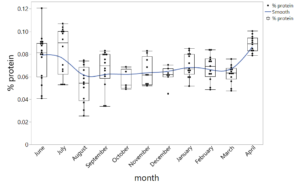
The next day my other mentor helped me to create a graph that shows all of my data together. We used a software called JMP to build one big data table from all of my mini data tables. We then used JMP to make a boxplot. I’ve attached a picture of the boxplot below! The blue line on my graph is showing the amount of brood the honeybees had each month. The months with the highest protein concentrations (June, July, and April) aligned with when the honeybees were rearing the most brood. This could mean a couple of different things. The first explanation is that the honeybees intentionally collect pollens with greater protein concentrations as they have more brood because they need protein to create the jelly that feeds brood. The second explanation is that the pollen available to honeybees during June, July, and April just so happens to have higher protein concentrations and honeybees are simply having more brood in response to this. I’m honestly still trying to wrap my head around all of this. I’m hoping the major conclusions and bigger picture will become clearer to me when I discuss further analysis with my mentors next week!
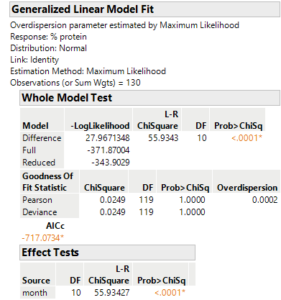
The next step was to determine if the results from my data could be considered significant. At first, we tried to use an ANOVA (Analysis of Variance) significance test. However, my data didn’t meet all of the assumptions of an ANOVA test because it showed “unequal variance”. So instead, we had to use a generalized linear model with a normal distribution. The p-value was less than 0.0001, so the results were VERY significant! This means that the differences in protein concentrations between samples were not simply due to chance. I’ve attached a screenshot below that shows the p-value generated from the generalized linear model.
Finally, I was very happy that this week I nearly finished my final PowerPoint presentation! I’ll talk more about that and my final product in next week’s blog. I hope everyone had a buzz-tastic week and thank you for reading!
Comments:
All viewpoints are welcome but profane, threatening, disrespectful, or harassing comments will not be tolerated and are subject to moderation up to, and including, full deletion.