Plungin In: Uncovering the Surface of Breast Cancer Data
Alisha J -
Welcome back to my blog!
This past week has been quite hectic as I delved deeper into the breast cancer data. I found myself constructing numerous tables in Excel, filled with hundreds of rows and columns. In addition, I’ve been comparing multiple datasets to identify their similarities and differences. During this process, I discovered a new tool in Excel—Power Query—that I had not previously utilized. This tool has enabled me to efficiently cross-compare various datasets and extract information from multiple sources, such as files and web sources.
However, I have encountered a challenge in the dataset comparison. Specifically, I am dealing with entirely different values (which I’d like the system to flag as discrepancies) and varying measures of accuracy (which are also currently flagged in the process). I am actively working to address this issue with my advisor.
Looking ahead to the upcoming week, I am focused on gaining access to .RAW files as I strive to understand how the authors transformed the original raw mass spectrometry data into the dataset provided on Kaggle: https://www.kaggle.com/datasets/piotrgrabo/breastcancerproteomes/data
Below are some screenshots showcasing the outcomes of my comparisons between two tables for both similarities and differences.
The first image illustrates a manual comparison I conducted in Excel for two rows, where each cell is flagged due to differing measures of accuracy or different values, despite identical cell values.
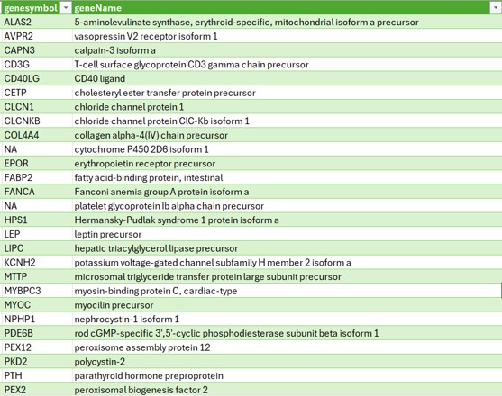
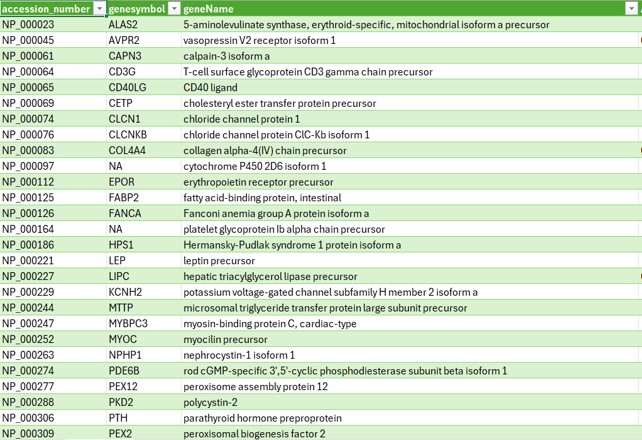
The final image shows the resulting table of differences when analyzing the gene symbol, gene name, and accession number across the two datasets.
Thank you all for your continued support, and stay tuned for further updates in the coming months!
Best regards,
Alisha Jindal
Comments:
All viewpoints are welcome but profane, threatening, disrespectful, or harassing comments will not be tolerated and are subject to moderation up to, and including, full deletion.