Graphs
Hello again!
This week, I’ve been focusing on my data analysis and presentation.
In terms of data analysis, I’ve been focusing on ways to visualize my data. It’s very important that an audience is able to understand your results, so showing them a graph is a great way to help them visualize what exactly you’ve found. I’ve been using Google Sheets in order to create graphs from the data that I already have, and I’ve settled on a format that looks like this:
This is a scatterplot of the data from my Burnout and Emotional Labor portions of the survey. Unfortunately, I’m really only able to show the relationships between two of my variables at a time, so I will end up having three graphs for my main scales (Burnout, Emotional Labor, and COVID-19 Anxiety) in total.
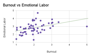
As you can see, I’ve also included a line of best fit on this graph in green, in order to show generally how the relationship trends, as well as how close the data tends to stay to the line. In this graph, the data generally trends upwards, indicating a positive correlation, but the data doesn’t follow the line of best fit very closely, indicating a somewhat weaker relationship. This nicely demonstrates visually the correlation coefficients between these variables: Pearson was 0.407, and Spearman was 0.465. This indicates a positive relationship, as both numbers are positive, so as burnout increases, emotional labor tends to as well, and vice versa. Additionally, these numbers are about halfway between 0 and 1, which is the range of possible values for a positive correlation. This means that, while the relationship is present, it is not considered a strong correlation, which is why the points on the graph do not fall as close as they could to the line of best fit. The difference between these numbers just refers to two different methods of finding a correlation. Pearson’s is a linear relationship, and Spearman’s is any relationship. However, it is good that these numbers are relatively similar, so that I do not have to indicate an explanation about the differences between the values.
I’ve definitely learned a lot this week about the importance of being able to effectively represent your data. I’m excited to do some practice presentations and gain some feedback on how I could improve on them, and eventually share them with the whole BASIS Phoenix community!
– Priya <3