Week 9: Data Graphs and Analysis
Eugene j -
Hey Everyone! I have now graphed all my available data. I have data from six volunteers, with three of the volunteers having a very large amount of data.
Here I will show some of these graphs, my analysis, and conclusions.
All of these graphs are from one person’s data. Each data point represents the average over the week. The data goes back six months.
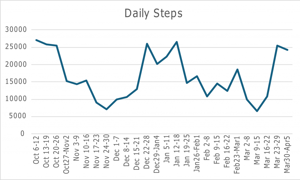
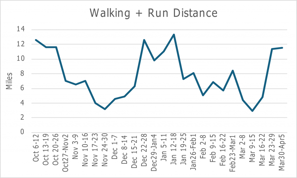
As is obvious and expected, the number of steps and the distance run or walked are directly correlated. In this case, during the week of December 1- 7th, this person took around 10,000 steps daily, traveling roughly five miles. That’s a lot to do every day.
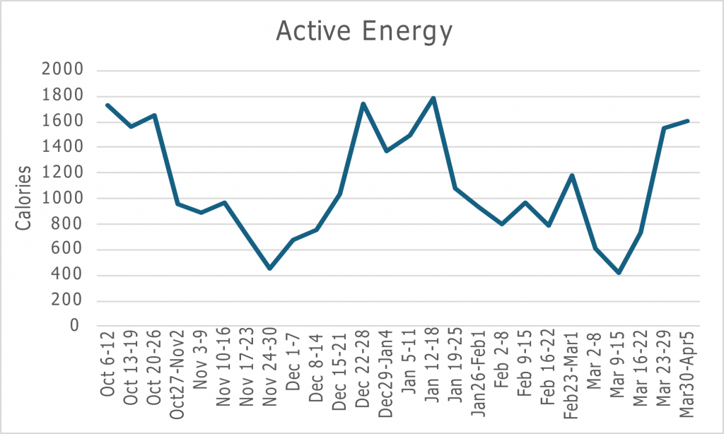
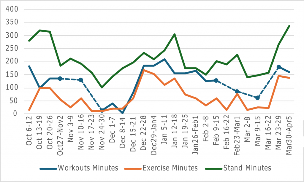
Here is Active Energy, which shows the number of calories burned above the normal amount burned through everyday activities. This also correlates quite well with the graph for steps. The next three graphs are on more exercise-specific variables.
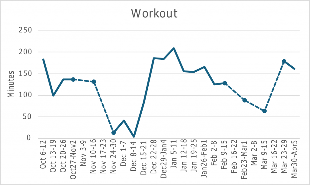
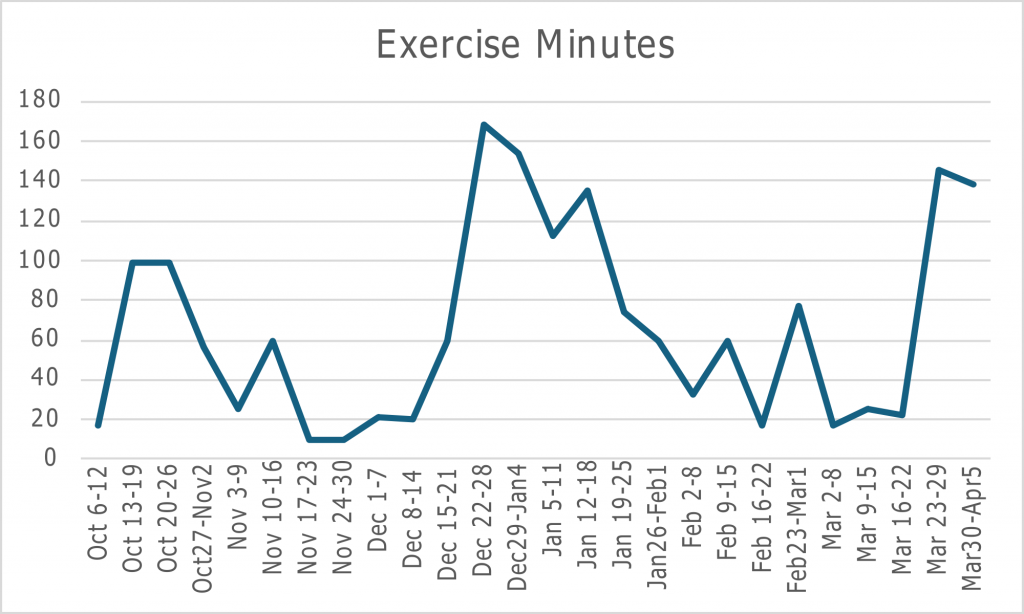
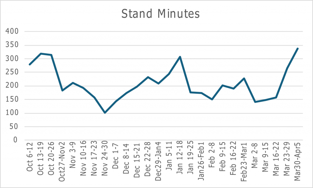
Both ‘Workout’ and ‘Exercise Minutes’ count slightly different things. Exercise minutes are counted as the total minutes spent sustaining an elevated heart rate, equivalent to a “brisk walk,” while moving. Workouts are typically counted by the time you start a workout on the watch and end it. Then there is Stand Minutes, which counts the minutes of any level activity, and as the name suggests, this includes standing. So, you expect Exercise Minutes to be the lowest, Workouts to be second, and Stand Minutes to be the highest. As seen below, this is correct.
Now, these are all the heart-related variables.
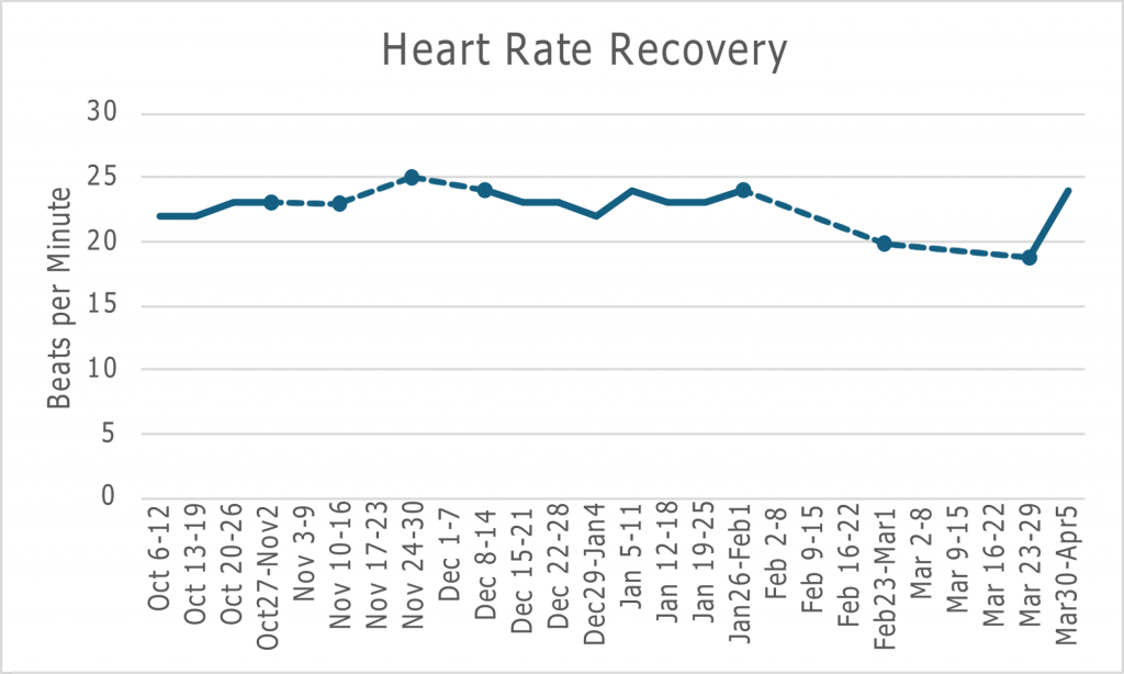
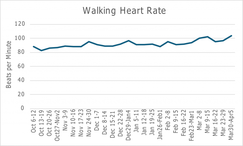
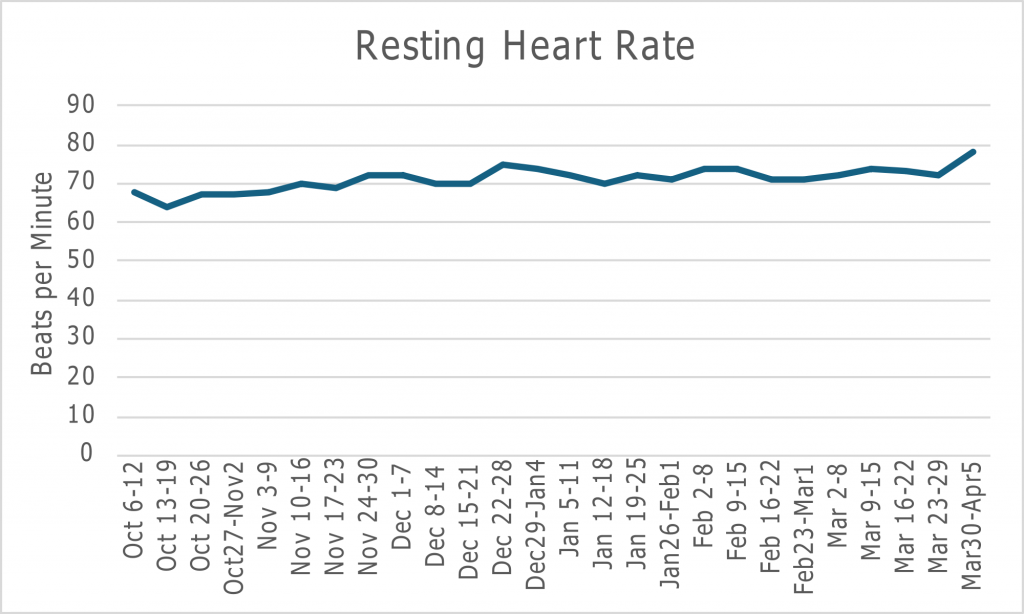
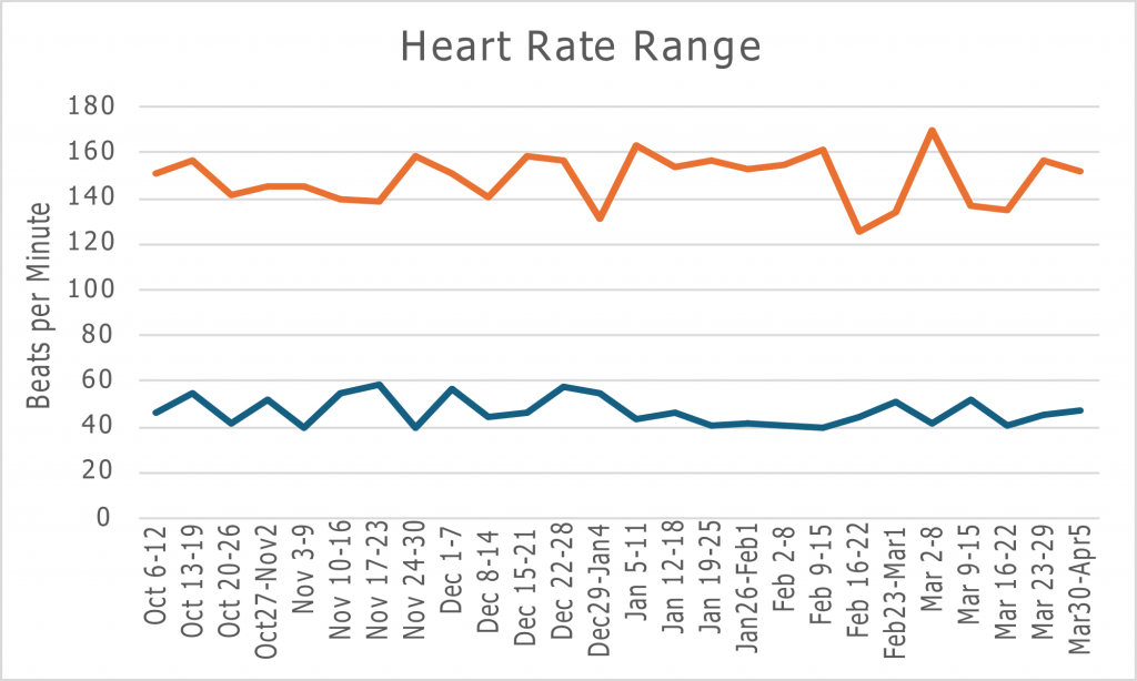
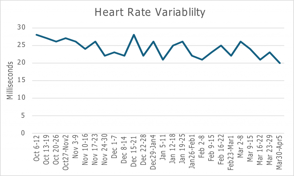
The graph for the heart rate range shows a lower heart rate, much lower than the resting heart rate. This is because all heart rates are used for the range, and this includes your heart rate while asleep, which is even lower than at rest. Also, heart rate variability is more, well, varied because the values have to be calculated from the resting heart rate, and the unit of measurement is so small. Overall, these graphs are relatively consistent, but there is a slight increase in walking and resting heart rate.
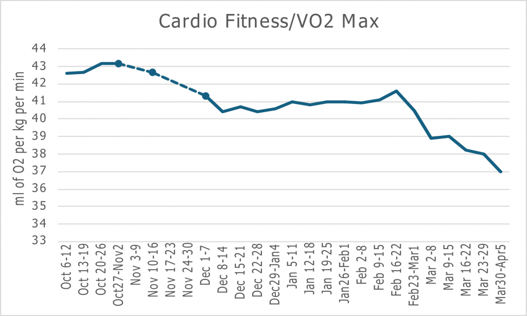
Now, here is VO2 Max, and this graph shows a significant change. The reason this changes so much is that VO2 Max is the most volatile variable. After the first four weeks of stopping training or exercise, you can expect a 10% decrease in VO2 Max.
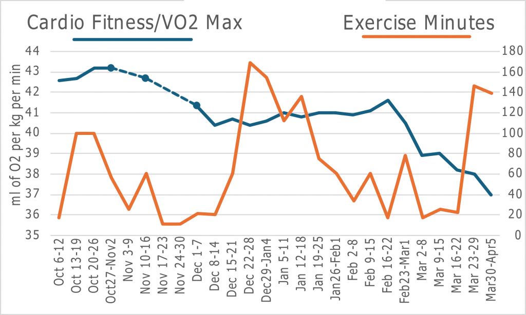
We can better see the trend with this graph comparing VO2 Max and Exercise Minutes. After the initial reduction in exercise from October 20-26, it takes one week for VO2 Max to start decreasing. Additionally, it decreases more quickly over the four-week period from November 17 to December 14, with Exercise Minutes remaining around 20 minutes. VO2 Max starts to increase as Exercise Minutes increase. Honestly, I don’t know why after the second decrease in Exercise Minutes, it takes around a month for VO2 Max to start decreasing, but once it does, it decreases rapidly. Now, assuming the trend in Exercise Minutes from March 23 to April 5 continues, VO2 Max should also continue increasing.
Now, I will compare this data to the population using a VO2 Max fitness Ranking Calculator from the University of Kansas. This volunteer is a 53-year-old male. Comparing his VO2 Max of 39 from March 2-8 to others of his age, he is in the 55th percentile of VO2 Max. Despite the data point coming from a reduced VO2 Max, this person still exercised regularly. Having a near-average VO2 Max doesn’t make sense. Well, this is because the data collection doesn’t take into account the effects of Flagstaff’s elevation. Considering elevation, his VO2 Max of 39 should be increased by 5-10%, resulting in a VO2 Max of 40.95 to 42.9. This places him in a range from the 66.9th to the 76.8th percentile.
Thank you for reading!
Comments:
All viewpoints are welcome but profane, threatening, disrespectful, or harassing comments will not be tolerated and are subject to moderation up to, and including, full deletion.