Week 6: Enhancing My YMA Display: Lessons in Color and Composition
Emma H -
Hello everyone! This week, I received feedback from my mentor, Kristen, regarding the YMA award display. I initially thought I was finished, but her suggestions helped make my display stand out even more!
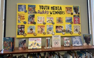
First, I had originally made the title, “Youth Media Award Winners 2025,” entirely black because I thought adding more colors would be overwhelming, especially with the already vibrant book covers. However, Kristen suggested painting the word “Award” in purple since it complements the yellow butcher paper, creating a subtle yet effective contrast. I couldn’t believe I had overlooked something as simple as complementary colors! Moving forward, I plan to be more intentional with color choices to make my displays pop.
Next, I ran into an issue with how I taped the book covers to the yellow butcher paper. I used blue painter’s tape, which turned out to be a mistake that cost me a lot of time. At one point, I was unhappy with the composition, so I peeled off some of the book covers—only to realize that the tape had torn the top yellow layer of the butcher paper, revealing a white layer underneath. Unfortunately, most of the covers had to be repositioned, so I had to peel off even more, making the problem worse. My mentor, Kristen, also encountered the same issue when she removed the young adult book covers since the display was meant for the children’s area. My solution? I carefully mixed yellow paint to blend seamlessly with the butcher paper, covering up the damaged spots. From this, I learned an important lesson—next time, I’ll use Scotch tape instead!
Here is the display put up in the children’s area! As you could see, there are book placed below that won the awards to promote their circulation!
Seeing so many of my displays in the children’s area is incredibly rewarding, and I’m proud to know that my work is making an impact at the library!
Thank you for reading this week and looking to see what next week brings!
Comments:
All viewpoints are welcome but profane, threatening, disrespectful, or harassing comments will not be tolerated and are subject to moderation up to, and including, full deletion.