Page Ten: Bringing Nina’s World to Life
Carly G -
Hello again, everyone! This past week has been one of the most rewarding parts of my senior project journey, and you’ll soon see why! As we approach the final stretch, I’ve spent most of my time illustrating full spreads and really ensuring I capture that dreamlike feeling within them.
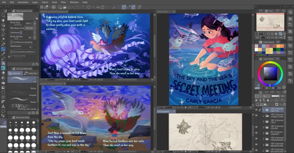
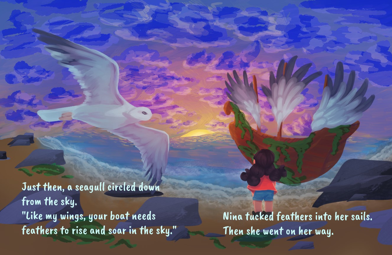
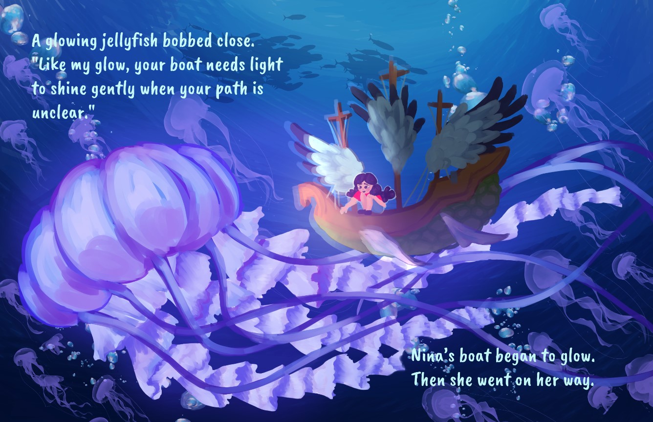
Attached below is a peek into my digital workspace, where you can see several illustrations open in Clip Studio Paint (CSP). Illustrating using CSP has been such a rewarding experience, and I’ve learned so much more about digital art than I thought I would. It has made coloring illustrations much easier, and thanks to digital tools within CSP—like gradient maps, overlay layers, and airbrush effects—I was able to transform flat color blocks into more luminous compositions. It’s allowed me to experiment with color more than I’ve ever done before, as I was always hesitant to “ruin” an illustration by incorrectly placing colors or shadows that didn’t work. I’m especially proud of the glowing jellyfish scene and the seagull with the sunset. These are two spreads that I believe truly capture the magical realism and emotional tone I’ve been aiming for since the beginning. Let me know what you think of when you see these illustrations!
Amongst some of the challenges this week, working with color and light was the most difficult. I wanted each scene to feel immersive and emotionally resonant, which meant learning how to create atmosphere and movement using lighting effects. At first, I was really intimidated and thought my limited time spent studying lighting and shadows would be too obvious and distract the viewer, but I think I pulled through. CSP’s digital tools helped me unify palettes and ensure everything looked the way I’d imagined. This was really important to me as the sole writer and illustrator for this project.
In the coming week, I’m excited (and a little nervous!) to complete the last few illustrations and prepare for my final presentation. I plan to bring a physical copy of the book (courtesy of a yearbook printing company) to share with attendees and classmates, and I can’t wait to talk about everything I’ve learned—from storytelling and layout to digital painting and design.
Thanks for following me along on this creative journey! This final stretch will definitely be the most memorable, I can just feel it. Lastly, I’ll include some full-size pictures below of my favorite illustrations so far. As always, stay curious!
Comments:
All viewpoints are welcome but profane, threatening, disrespectful, or harassing comments will not be tolerated and are subject to moderation up to, and including, full deletion.