Week 7- Analysis and Comparison
Hey y’all I’m so excited that y’all decided to join me again for my blog! This week I just ran the program a couple more times with some different datasets, and I also got to meet some new people.
To start I ran our program in Matlab this week with some of the datasets that I mentioned creating last week. I put the semi-checkerboard into the program, and I got some pretty shocking results. This gave the green voters a vote share of 41.25%.
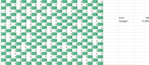
My original hypothesis said that It should severely diminish the amount of seats that the green voters won as the semi-checkerboard gave the green voters 41.25% of the vote instead of 50% of the vote. This would thus make it much harder for the algorithm to create maps that would give them 75% of the seats again. We may begin to see the expected trend of 50:50 because of this.
This ended up being completely wrong, because the green voters average around 1 seat which is completely different from the 15 seats they won from the original checkerboard set. I think this is because the greens are not clustered at any point of the data set which makes them extremely spread out, making it hard for them to form winning coalitions. Especially when green voters are always almost surrounded by white voters on all ends. So because of how the whites are distributed with occasional clustering it is much easier for them to win.
The second dataset that I used would be the uniform clustering set. The average vote share for the green voters for this set is 31.5%. In this set, there are several clusters randomly distributed on the sheet, but they are all the same pattern. The results were still very shocking to me, as that seems to be a common trend with almost every set that I run through the program.
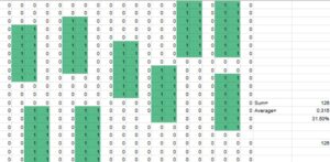
I thought before we ran the program it would lead to a lot less green seats because it would be very easy to pack them into just a few districts as the green voters are all right next to each other. I also thought it would be impossible to win anywhere near half of the districts because the green voters just aren’t distributed enough to get that many seats. I predicted that it would lead to less districts proportional to their vote share.
The results ended with the green voters winning an average of 9.5 seats which is roughly equivalent to 48% of the seats, well above their vote share. I think it is because when you reach a certain level of segregation it becomes hard to dilute the vote, because it’s hard for the 0s to counteract the presence of 1s in the area.
I then finally put the nonuniform clustering dataset into the program, and following the results of the semi-checkerboard it made sense. However, I formulated all of my hypotheses before I ran the programs this week. This set had the green voters getting a percentage of 33.5%. The pattern in this set is that there are randomly placed clusters of green voters but they are all organized differently.
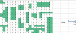
My original hypothesis said that having all the green voters cluster makes it much easier to pack them and would thus lead to less green representation, when compared to the average. I believe it will lead to better representation than uniform clustering as it would be harder to determine patterns through the algorithm. Also the ones have a lower percentage than the zeroes giving them a harder time.
The actual results showed that they would usually receive an average of 7.8 seats which roughly equates to around 40% of the seats. This contradicts what I said in my hypothesis as they actually got more seats percentage-wise than their vote share. This is because by having clusters it is much easier to get a majority of the vote in districts from those areas, and they are big enough to lead to a decent amount of districts. This does lead to districts not being very competitive however as they are either dominated by 1s or 0s with very little interference.
Another thing that I got to do this week was meeting the people who would be working on further research concerning this topic during the summer. I met JJ and Arthur who are bother undergraduates at Trinity University studying math, and they are going to be using a lot of the data that I got in order to help determine whether they can create ways to make a computer program that could lead to more proportional results. This is different from what my project primarily concerns as I’m looking to determine a relationship between segregation and gerrymandering as the main product. It was still very cool to hear how they were going to use my work during the summer. I also had to introduce them to the project and a lot of the programs that we use as they are new to the team, and they haven’t engaged in this research before.
Thank you so much for reading my blog, and I can’t wait to read y’alls thoughts on my work this week!
Comments:
All viewpoints are welcome but profane, threatening, disrespectful, or harassing comments will not be tolerated and are subject to moderation up to, and including, full deletion.