Numbers, Spreadsheets, Graphs
Hello everyone! I’ve done a lot more data analysis and I’ve found a few more interesting things. I’ve made as many graphs as I can to visualize the data.
First, these are the stress strain curves for every test I did.
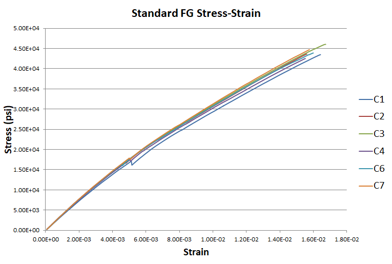
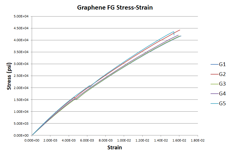
These graphs show how closely the test specimens performed compared to each other. All the lines are close to each other, so there were no obvious discrepancies.
Next, this graph compares the average stress vs. strain for the regular and graphene groups. Although I expected the graphene to do better, it actually performed slightly worse.

The curves flatten out over time as fibers in the test specimen break.
I also compared my data to ACT:

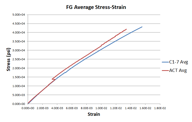
In the beginning and more linear part of the graph, my data matches ACT’s almost perfectly.
Another important number I investigated is the elastic (Young’s) modulus of each material. Like I discussed a few weeks ago, a higher elastic modulus means the material is stiffer. ACT calculated their elastic moduli to be 2.83 * 106 psi for the regular fiberglass and 3.08 * 106 psi for the graphene fiberglass. However, I couldn’t figure out how they got those numbers. It’s most likely they picked two points on a linear area of the graph and took the slope. I calculated the elastic modulus for my tests and found the averages to be 3.71 * 106 psi for the regular fiberglass and 3.52 * 106 psi for the graphene fiberglass. I decided to recalculate the elastic modulus for ACT’s data in the same way I did mine, and got 3.60 * 106 psi for regular and 3.42 * 106 for graphene.
In some ways this made me even more confused because from all I could tell, ACT’s graphene fiberglass also didn’t perform better. Part of the difficulty of getting good numbers was caused by slipping during ACT’s testing. In this graph of the graphene fiberglass the lines don’t follow a smooth curve like they should.

Now that I’ve done most of the data analysis, I need to finish drawing conclusions and finish the paper.