Week 5: Choices, Choices, Choices!
Emma K -
Welcome back readers! I’m excited to show you some of my planning pages on Krita today! This week, I was mostly testing out new brushes to see which ones would get me closest to a watercolor-like effect, or generally a more painterly effect. I started with the brushes I most often use, like the basic pencil or the round brush. However, I soon realized that while these brushes may work for my usual art process, they didn’t really fit the “painterly” aspect I wanted. And so began the hunt for the perfect texture.
)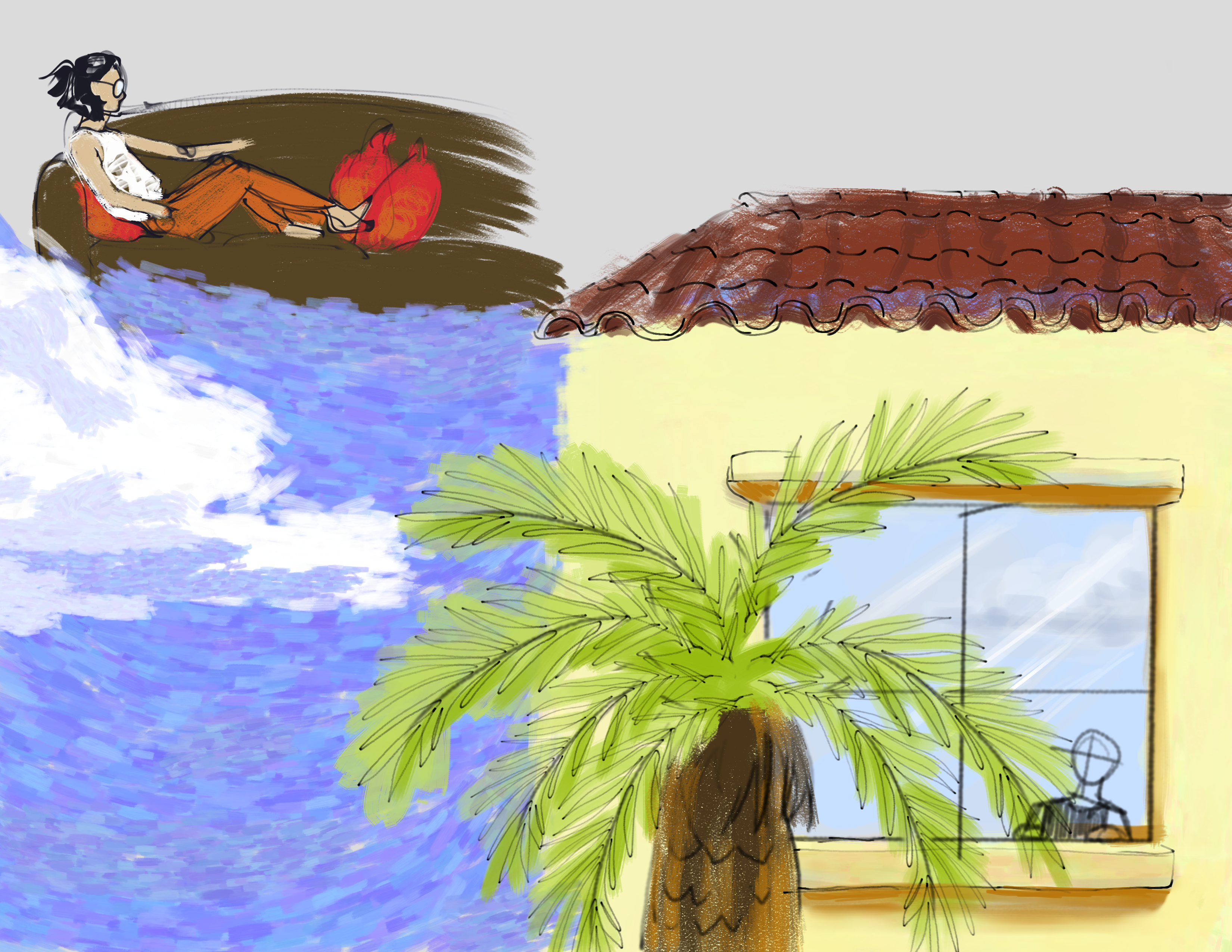
During the process, I discovered so many new brushes I had never used before! The texture brush that I used for the sky in the image above, for example, reminded me of the sky from Van Gogh’s “Starry Night”!
After the long process of narrowing down my options, I finally decided on the glass pen texture brush for my sketch and line art, then two different dry paint texture brushes for coloring. The glass pen texture allowed me to create expressive lines like I would with a real pen on paper, which helped make my sketches feel more lively.

In the image above, I tested out different colors and attempted to draw a character in a new style. Usually, my art style is sharp and loose, so trying out a cleaner, concise line art was a bit of a challenge. I decided to swatch, or record, the colors I used for future reference and consistency.
Once I finished testing everything out, I realized that the colors I had used seemed a bit dull. I tried changing the value of the gray background to see if it was an issue with the relative values, but it didn’t seem to have much effect. So, I plan to play around more with colors, value, and vibrancy next!
Thank you for reading and see you next week!
Comments:
All viewpoints are welcome but profane, threatening, disrespectful, or harassing comments will not be tolerated and are subject to moderation up to, and including, full deletion.