Turning Numbers into Pictures
Daniel j -
Last week, I worked with the input side of the GUI simulations. This week, I worked on the other end, familiarizing myself with the output files and how they worked.
There are two types of outputs that this GUI needs to produce: the Energy vs. Transmissions Graph and the Electron Density Graph.
When I was initially handed the output files and the code that used them, it all seemed very complex. The text files would be filled with rows and rows of seemingly random numbers, and the code that dealt with these files was, once again, in Fortran, so I had to learn to translate it into Python as well.
But as I began reading the code, it became increasingly clearer how the text files were being read and interpreted. By looking at the numbers in groups and finding incremental patterns, I realized that certain columns corresponded to different variables in the graphs, and all the code was doing was looping through the values and graphing them.
After understanding this, it was relatively easy to translate into Python. I imported the files into my local Jupyter notebook on nanoHUB and ran the code. This is what I got:
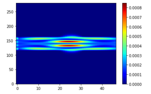
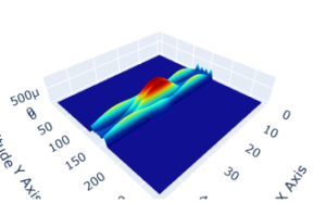
These three pictures represent the outputs of the quantum wire with a well going through it that I briefly mentioned last week (the new geometries that I created last week should come later when I link the inputs and outputs).
The first picture is the transmission vs. energy graph, where different energy levels produce stepwise transmissions that show conductance quantization. One interesting aspect shows up on the final step, where there is a dip. Mr. Speyer told me that these types of points are what we should be looking out for, where very interesting behavior occurs out of slight changes to geometry.
The next two graphs show the top view and side view of a 3D representation of electron density. These graphs are very interesting in that they show the probability of finding an electron at a specific point. “High electron density” doesn’t necessarily mean the same as it would if you were to say “high matter density” in the sense that the actual thing exists in that space. Rather, it means that there is more chance to find an electron there than in areas of lower electron density. But that’s the theoretical side of things. In practical use, this graph is especially useful in seeing how electrons behave within the nanodevice, specifically through different quantum geometries.
Another point about the last two graphs is that they show a single “frame” (specifically frame 150, around where the interesting dip in the transmission graph seems to be) out of a total of 200 frames. What this means is that there are 199 other frames of different energy levels to iterate through, which all output different electron density graphs. This means that I also have to find a way to display all 200 frames. To address this, I have started trying to create a small video GIF or a slider (this will be in next week’s blog). But even on top of that, each transmission graph is a model that depends on the user’s desired geometry input. So, basically, there is a lot more work to be done.
This upcoming week, I hope to figure out how to display all the frames and get started on how to link the inputs and outputs.