Finally Going Large-Scale
Divya p -
Welcome back to the final week of blog posting!
I promised I would wrap everything up by this week, so here I go. This week, I finished putting together the large-scale risk model! It took quite a bit of experimenting with R in RStudio, using different graphing functions like ggplot2 and geom_line to really organize the graph in the way I wanted it to look. It worked after a lot of trial and error, and here is the output:
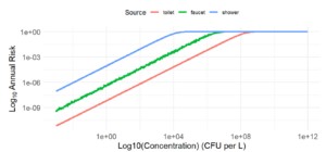
I am going to title it “Probability of Infection Annually from Different Contaminated Water Sources.” I showed this graph to my advisor and he approved my results.
As far as explaining the graph goes, what we have are the three sources of contaminated water that I’ve been examining in depth (faucet, shower, and toilet) and how the risk of getting an infection (getting Legionnaires’ disease, Pontiac fever, pneumonia, etc.) would be predicted to look like annually. The results concur with what I was expecting: There is a positive linear association between concentration of L. pneumophila (CFU/L) and annual risk/probability of infection (%) for all three exposures. It’s good to point out that the graph tapers off at 1e+00 because we have reached the greatest probability of risk at 100% even though Cw can still be greater. What we can conclude from this graph is that showers pose the greatest risk to L. pneumophila infection, toilets pose the least risk to L. pneumophila infection, and faucets are more close to toilet’s risk than shower’s risk. This makes sense, because our full body comes into contact with the water droplets/aerosols in a shower, whereas in a toilet maybe we come into contact with a couple aerosols at most. The risk grows linearly when we log10 both axes. Log10’ing both axes allows us to see a much clearer pattern to this graph. We see the linear growth of annual infection risk with bacterial concentration because the chance of infection from one bacteria cell is independent of the other bacteria cells, which assumes that each bacteria has a non-zero probability of infection and can be a sole cause of infection. Then, if we increase the number of bacteria cells then we linearly increase the probability of the infection occurring.
Of course there were some pitfalls in my large-scale risk model. I wasn’t able to include sources of contaminated water like cooling towers or misters, to which I talked about in my source apportionment blog. I was able to research a bit about each source, but encoding all of that in a graph on R would take more than 10 weeks. Nevertheless, I am happy with the risk model I made through RStudio, and I believe it accurately represents the risk of getting infected by L. pneumophila.
Thank you for reading my blog, and it has been a wonderful 10 weeks of research!
Comments:
All viewpoints are welcome but profane, threatening, disrespectful, or harassing comments will not be tolerated and are subject to moderation up to, and including, full deletion.