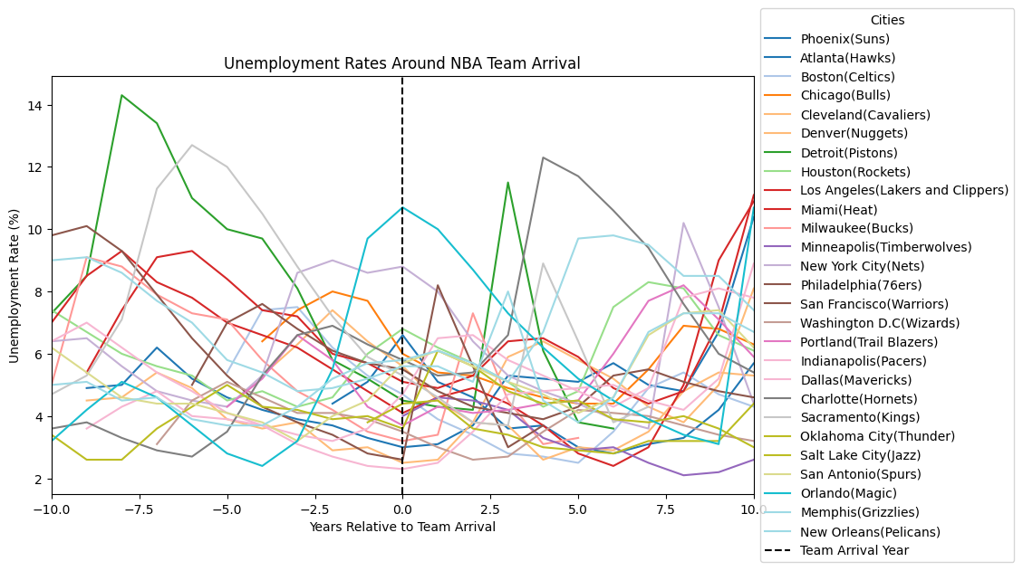
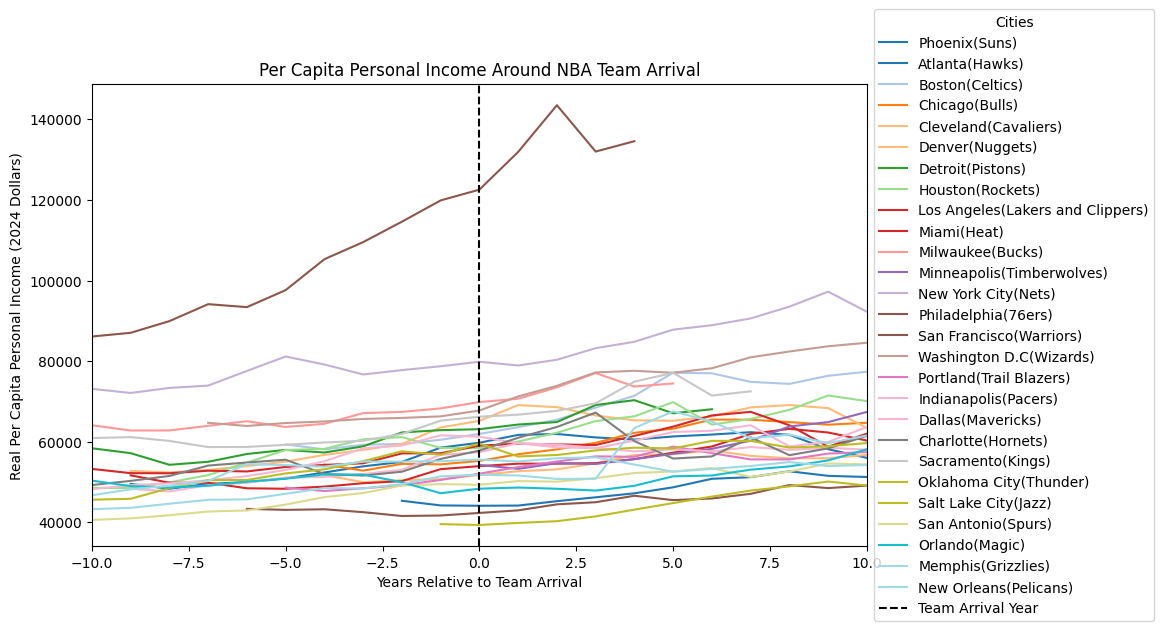
Graphs, Graphs, And More Graphs
Welcome back to my blog! This week the process of visualizing my spreadsheet data into graphs continued. Following the framework code seemed simple enough, but I had to make a few adjustments. When I centered my unemployment graph around the year that a particular team arrived in their city, I was left with too much data on the right side of zero (check the graph in last week’s blog) because I could only find economic data from the years 1990-2024 and many teams most recently moved closer to the 1990 mark. With this graph, the x-axis stretched to 30+ years after a team’s arrival for certain cities, which is outside the range I want to be looking at. I decided to limit my graph to 10 years before and after a team arrives because it better focuses the graph on the team’s arrival year. Now, I just had to figure out the code for it. This was pretty easy to do in the Python pandas library. All I had to do was add plt.xlim(-10, 10) in the for loop of my code and the x-axis would be limited to 10 years before and after arrival.
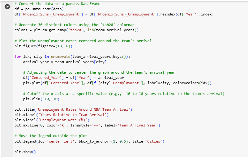
As I continued copy-pasting my unemployment data for each city into my code, I would run the code each time to ensure that my graph came out correctly with a new line for each new city added. However, when I reached the 11th city, I noticed a problem–the line colors in my graph legend had started repeating. My framework code only allowed the same 10 colors to be used for the line colors, so I had to do more research to fix this problem. In the end, I generated 30 different colors for my lines using the ‘tab20’ colormap in pandas and the code colors = plt.cm.get_cmap(‘tab20’, len(team_arrival_years)). Here is a sample from my complete code for my graphs:
With this last adjustment, I finished graphing all 27 of my NBA cities for unemployment rate and repeated the process to graph for per capita personal income (PCPI). With these graphs, I can visually see the change or lack of change in unemployment rates and PCPI with the arrival of these teams. But next week I will be using statistics tests to test if there is an actual statistical significance in the changes of these city economies compared to the national averages.
Comments:
All viewpoints are welcome but profane, threatening, disrespectful, or harassing comments will not be tolerated and are subject to moderation up to, and including, full deletion.